Seamm · 2023
Push Notifications Manager
How to kill the send button nobody wanted to press.
Designed a push notification system that eliminated blind sending, gave marketing full autonomy, and increased campaign velocity 3.75×.
Product Designer — UX, UI, design system
Seamm product team
- PM
- Design Lead
- 2 Engineers
- Product designer (Me 👋)
- ~30 min → 2 min creation time
- 3.75× campaign velocity

Why we started
Every push notification required marketers to message the engineering team via Slack, wait for availability, then have a developer manually query the database and send. Engineers — whose time costs significantly more — were pulled from product work to handle routine marketing tasks. Marketers had no visibility into how notifications would appear on users’ devices, and with no preview or review step, a single typo could reach thousands of users instantly.
But unlike content that can be unpublished, push notifications are irreversible. Once sent, there’s no undo. A typo reaches 10,000 users instantly.
Three things made this a high-anxiety task:
- 01No visual preview — marketing couldn't see how the notification would look on a device before sending.
- 02Error-prone targeting — reaching specific users required external lists or manual IDs.
- 03No safety net — without a review step, the fear of a mistake going to thousands of users was paralyzing.
Solving ‘blind sending’
The core pattern was a real-time preview that updates as the admin types. I used the actual app pop-up proportions to make the preview realistic — not a generic mockup.
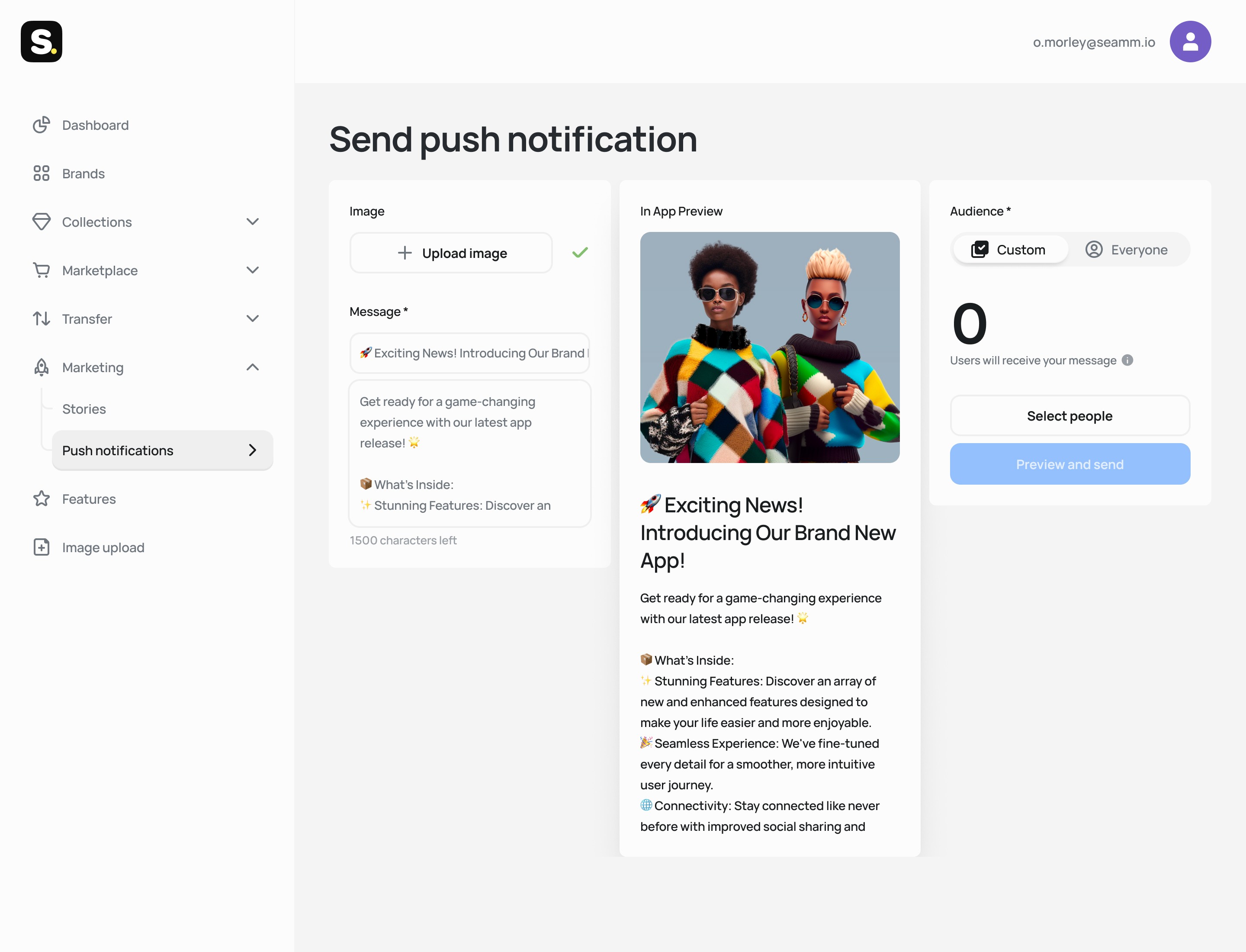
I considered a separate Preview step — Edit, then Save, then Preview, then Send. But I chose live preview because it reduces friction, enables rapid iteration (3 message variants in 2 minutes), and eliminates undo anxiety.
Who receives this?
Audience targeting was the trickiest interaction design problem. The default shows total addressable audience with an ‘Everyone’ button. Custom selection opens a modal for searching by username, email, or ID. The table displays metadata — registration date, last activity — so admins can verify they’re selecting the right users.

I considered displaying filters directly on the main screen. But I chose a modal because 80% of campaigns target fewer than 50 users, simple search handles the majority of cases, and it keeps the main composer clean.
Zero-state
If zero users are selected, the system shows a large visual indicator: ‘0 Users will receive your message.’ The send button stays disabled. This sounds obvious. But without it, it’s trivially easy to fire a campaign to nobody — or worse, to everyone by accident.

The anxiety-free confirmation
This is the feature I’m most proud of. Before the final send, a dedicated review modal shows: a summary recapping the exact audience count (‘Send to 238 users’), one last look at the notification creative, and a clear CTA stating the action and scope — removing all ambiguity.

Results & system design
100% layout accuracy
The preview removed guesswork completely. Zero 'broken' notifications reaching users post-launch.
3.75× campaign velocity
Creation time dropped from ~30 minutes to under 2 minutes. 15 campaigns in the first month, up from 4 average. The team started testing 3 messaging variants per feature launch.
Engineering freed
15+ hours/month redirected to core product features. No more 'Can you send this campaign?' Slack messages.
Under the hood
The notification manager uses the Seamm Admin Design System I maintained — form inputs with validation states, button states, status indicators. A shared component library reduced development time and ensured UI consistency, so the team could focus on the harder, scarier parts of the workflow.

What I learned
Self-service tools are anxiety products.
The primary user emotion isn't 'I want speed.' It's 'I'm terrified of a mistake reaching thousands.' The confirmation modal, live preview, and zero-state guard all address fear, not efficiency — and became the most praised features.
Design for the 80%, don't hide the 20%.
Most campaigns targeted a handful of users. A full filter system would have added complexity for everyone to serve rare cases. Modal targeting kept the default path fast without limiting power users.
Redirect expensive time, don't just save time.
The real win wasn't '30 min → 2 min.' It was freeing engineering hours that cost 3–5× more than marketing hours, and letting each team focus on what they do best.
More case studies
ReMargin
I wanted a reader where annotations matter as much as the text. Built one.
Stories Editor
How I eliminated a 2-day content publishing bottleneck
Educational Platform Redesign
Users couldn’t explain what a single menu item meant
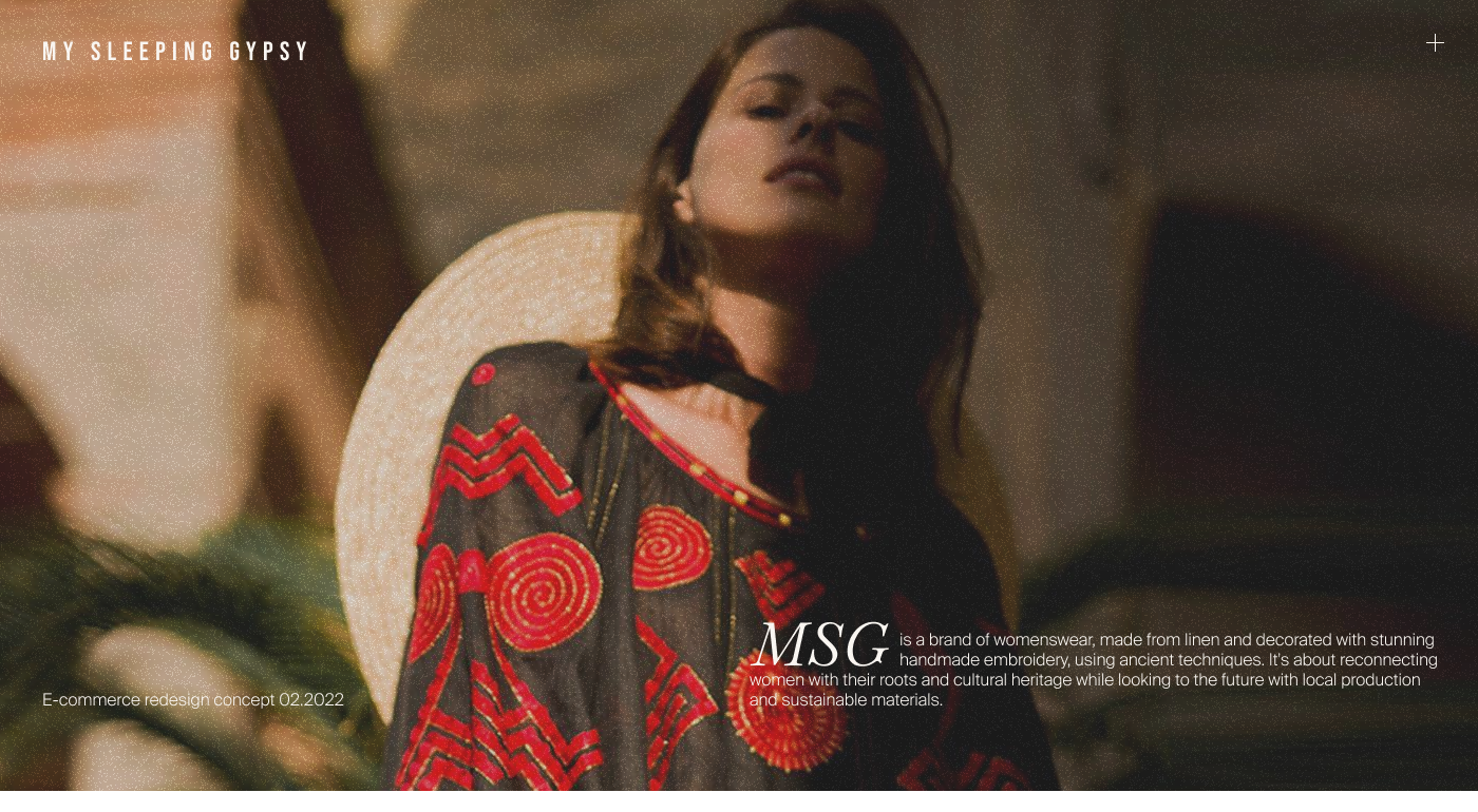
My Sleeping Gypsy
How to sell heritage craftsmanship without looking like fast fashion
Multi-Agent AI Workflow
I built a 10× prototyping workflow using AI agents — and what it taught me about product design
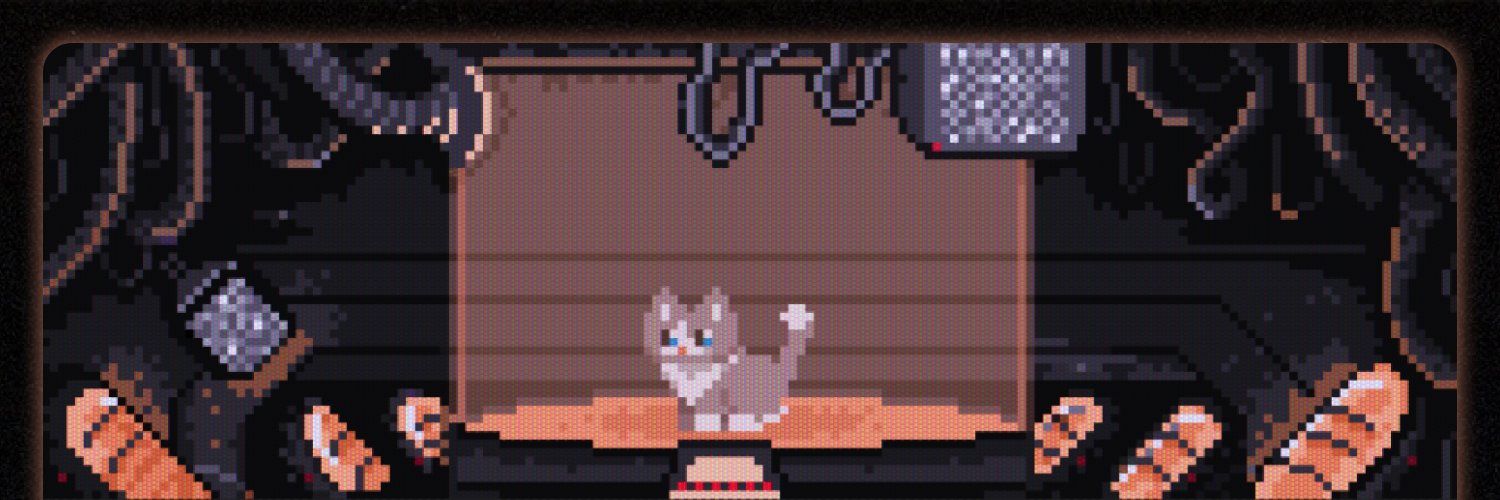
3D Museum Puzzle
Applied to a casual game studio, got rejected, built a working 3D puzzle prototype instead.