E-Commerce · Web Design · 2022
My Sleeping Gypsy
How to sell heritage craftsmanship without looking like fast fashion.
Web Designer
- UPROCK
- My Sleeping Gypsy
2022
- E-commerce redesign
- Design system
- UX research
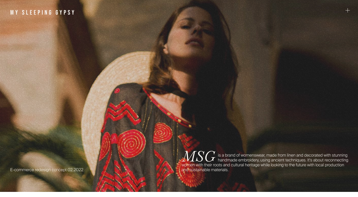
A premium product on a generic-looking site
My Sleeping Gypsy is a women’s clothing brand that makes handmade embroidered linen pieces — dresses, skirts, blouses, suits — priced at €300–800. Everything is locally produced, hand-embroidered, made to order.
The existing site worked functionally, but had zero stylistic integrity. It looked like a generic marketplace, not a premium brand. The visual gap between the product quality and the site quality was massive.
Three parallel analyses before any pixels
I ran three streams in parallel — competitive, audience, and visual industry analysis — before touching the design tool. The goal was to understand what makes premium fashion sites read as premium, so the redesign wouldn’t default to standard e-commerce patterns.
Competitive analysis (8 direct competitors)
- 01Most competitors had no real brand positioning — their sites were just storefronts with a product grid.
- 02The ones that stood out used editorial photography and brand storytelling, not discounts or aggressive CTAs.
- 03High-quality photos and thoughtful product descriptions were the strongest purchase motivators — not designer fame or price drops.
- 04Navigation was messy across the board: collection names in the main nav that meant nothing to first-time visitors, important pages buried in footers.
Audience
- 01Women, 25–45, income $2 000+/month.
- 02They research before buying. Clothing is treated as an investment, not an impulse purchase.
- 03Lifestyle: cultural events, fashion-conscious, values craftsmanship and individuality.
Visual industry analysis (Awwwards-level fashion sites)
- 01Headings: serif fonts, large sizes referencing print magazine typography.
- 02Body: grotesque fonts, Regular weight, sometimes Light or uppercase.
- 03Colors: either pure black/white or soft pastels — any forced accent color looked cheap.
- 04Photography: emphasis on details and emotional model shoots, not plain product shots.
- 05Buttons: rectangular, outlined, minimal — filled buttons looked out of place.
Editorial pacing, end to end
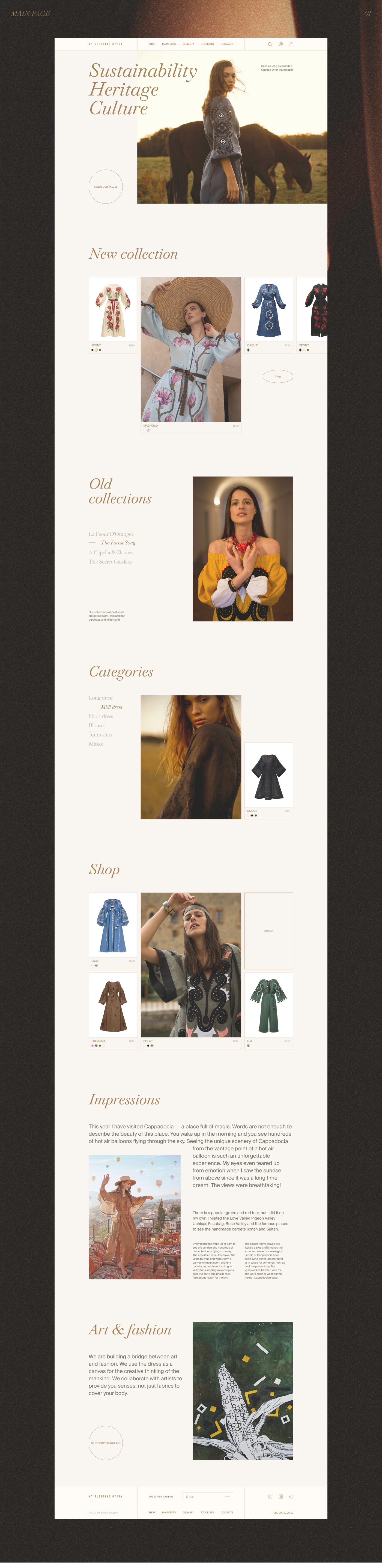
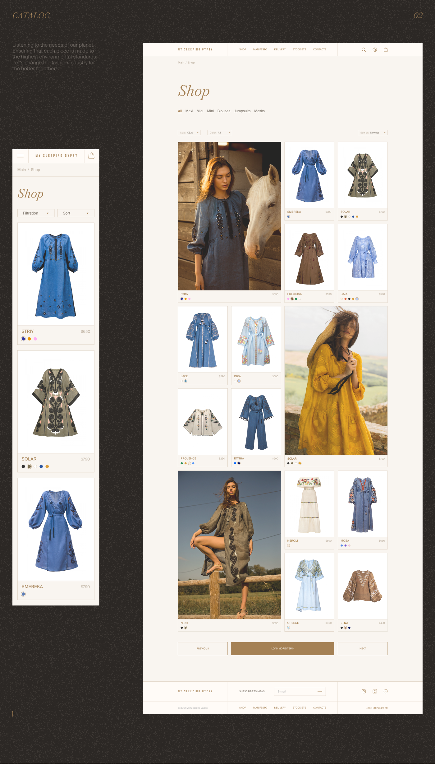
The redesign treats the catalog like a magazine spread: large imagery, generous whitespace, and a story-first homepage that lets the brand breathe before any price tag appears.
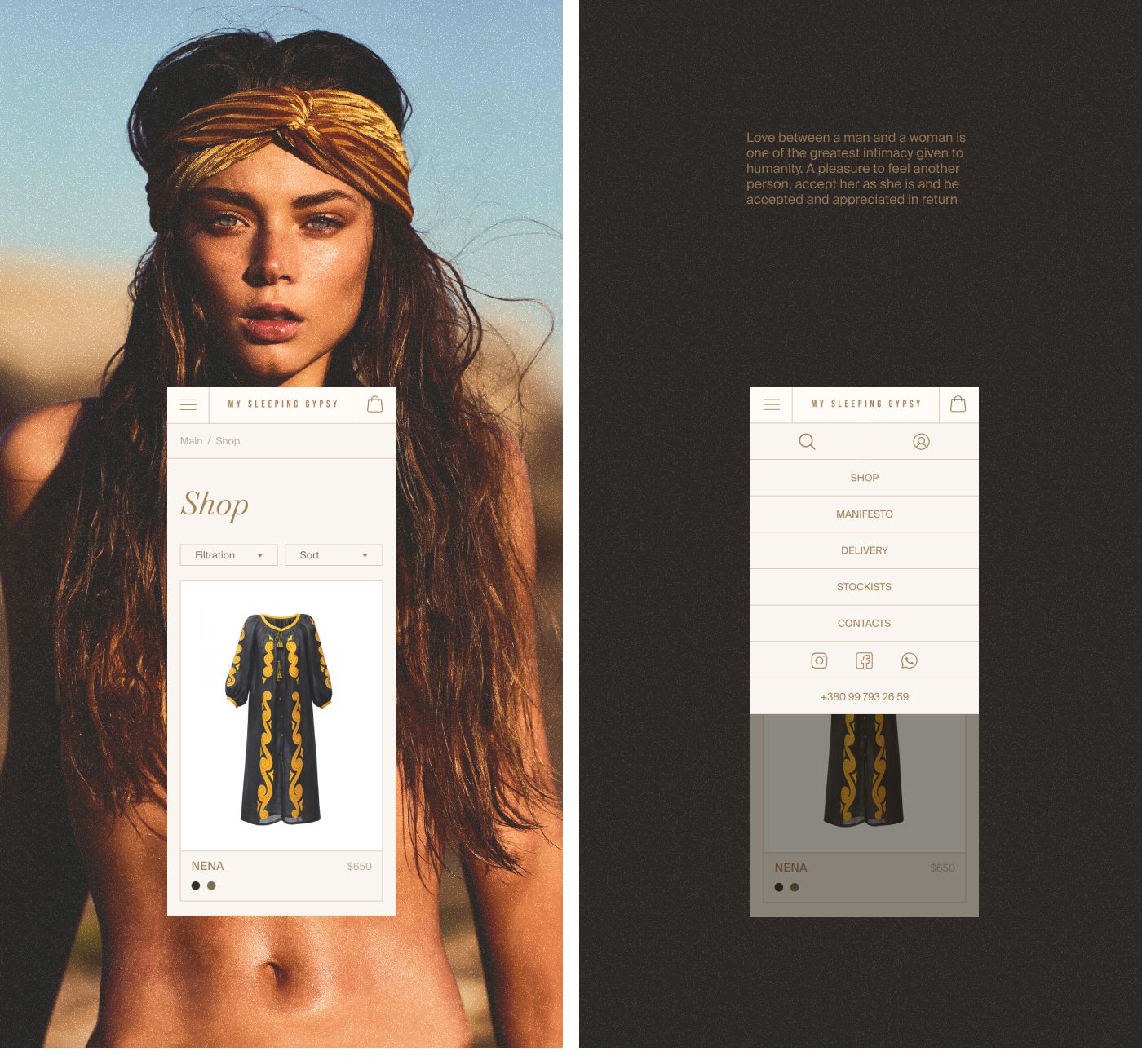
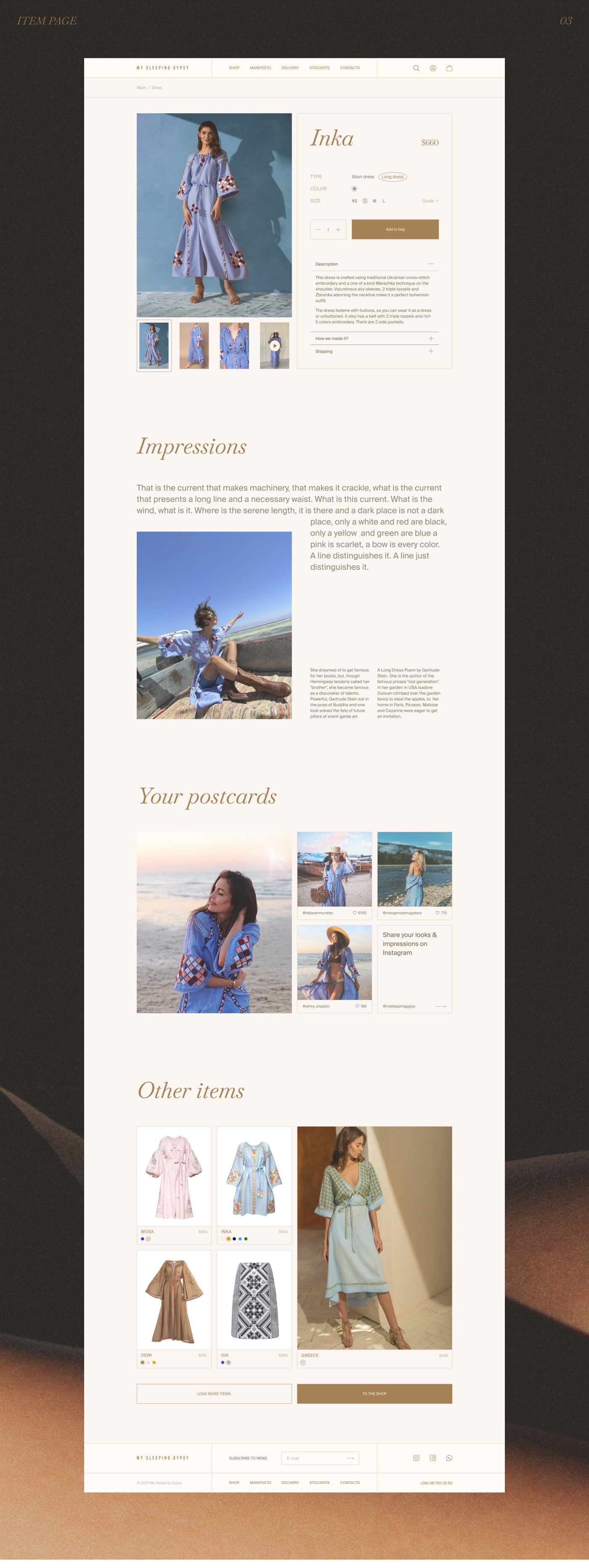
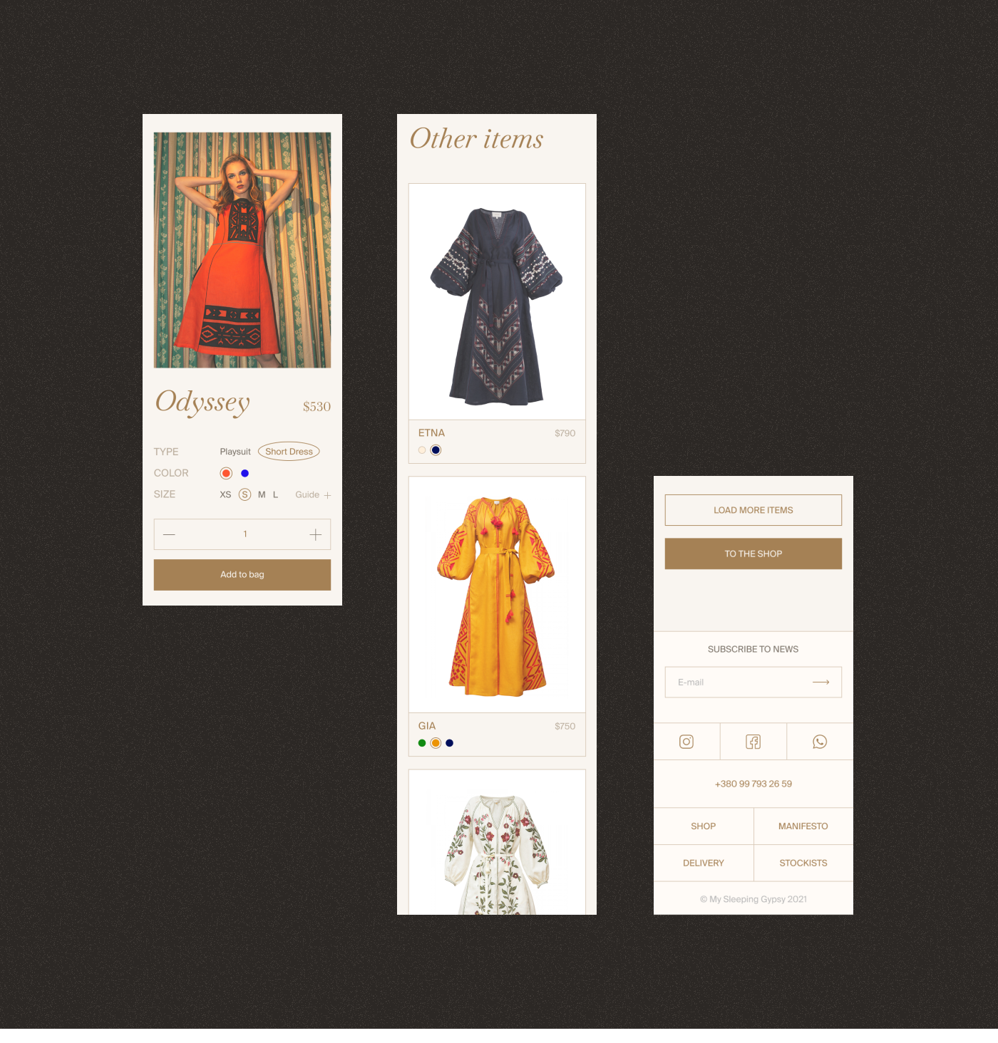
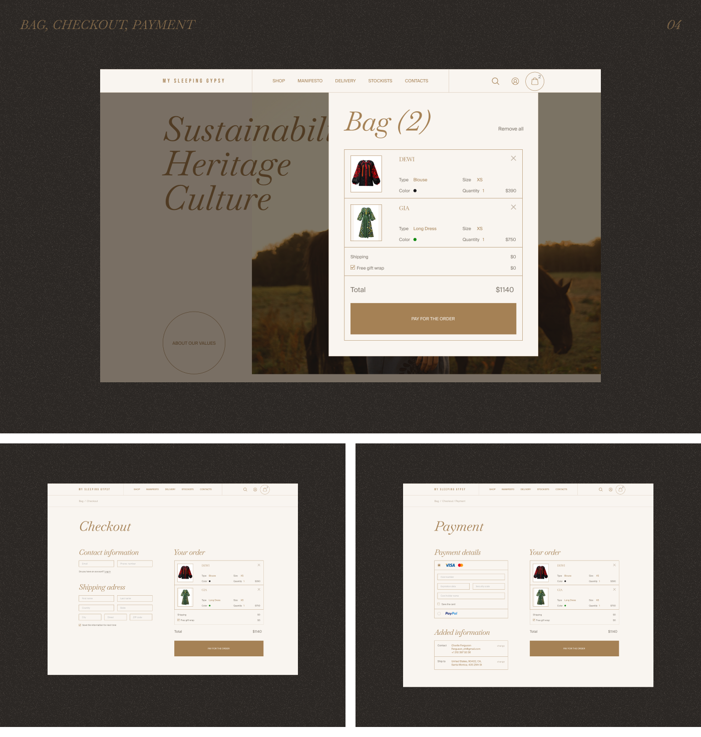
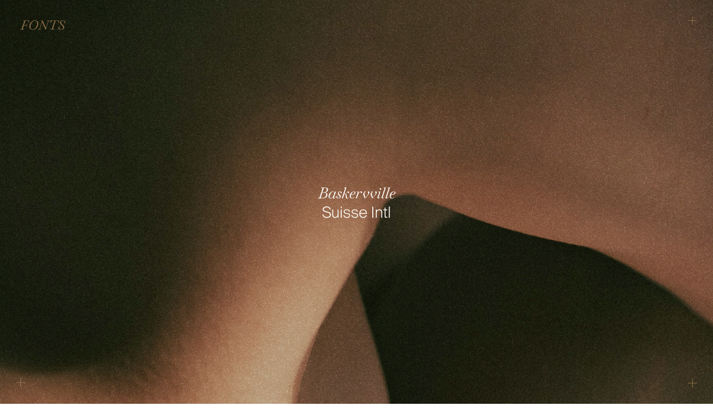
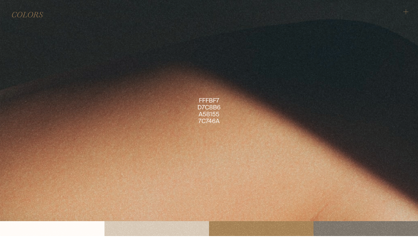
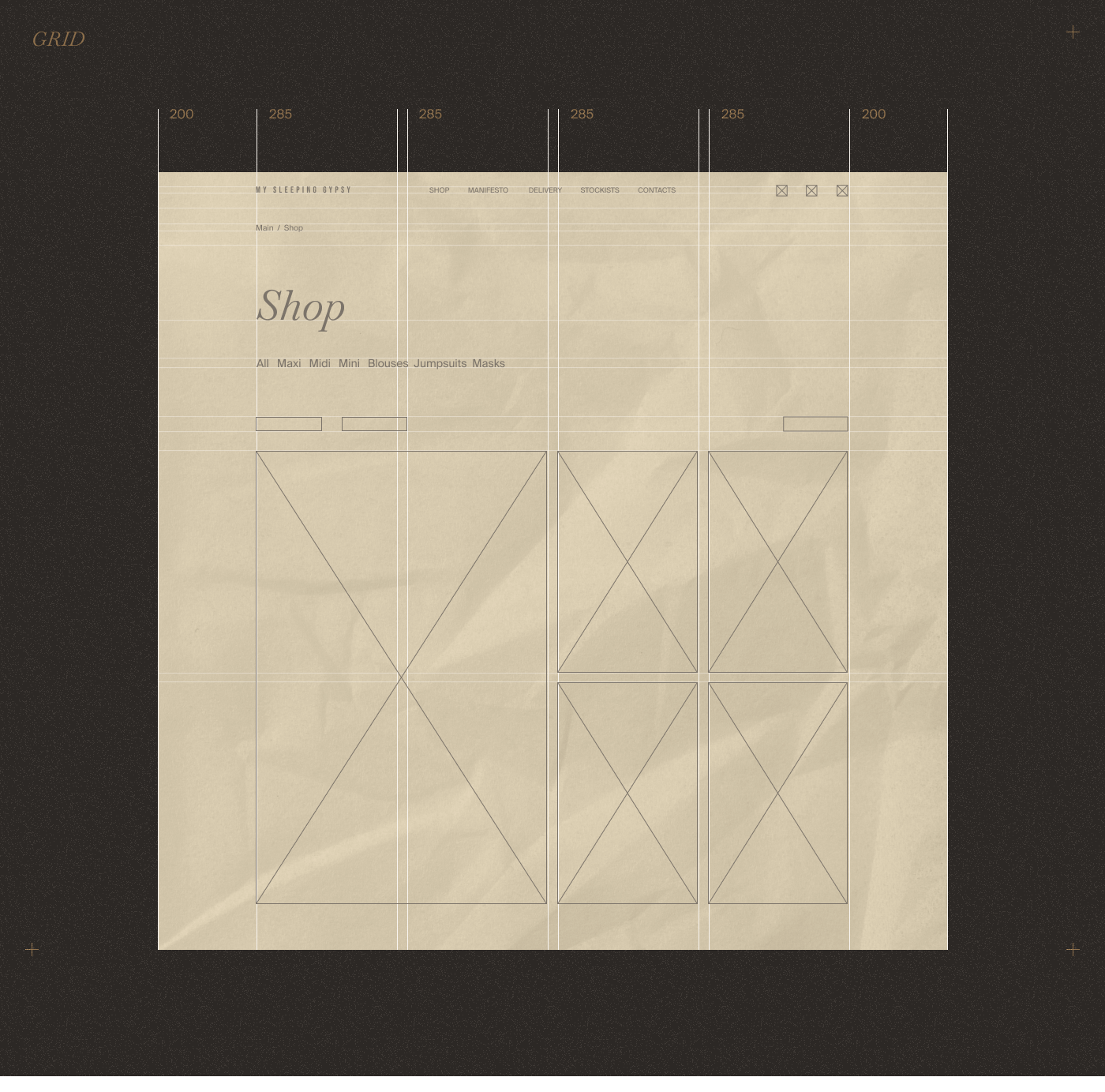
Four design calls that shaped the brief
Each decision pulled the design further from default e-commerce patterns. Together they signal: this product is for someone who reads the story.
What I learned
Strategic friction
Fast checkout and aggressive CTAs work for fast fashion but destroy premium positioning. Editorial pacing forces users to slow down and appreciate the craft. Sometimes good e-commerce design means adding friction, not removing it.
Research before pixels
Running competitive, audience, and visual analysis before designing saved me from copying patterns that don’t fit. Most competitors looked like generic marketplaces. The research made it clear: the site should feel like a brand, not a store.
More case studies
ReMargin
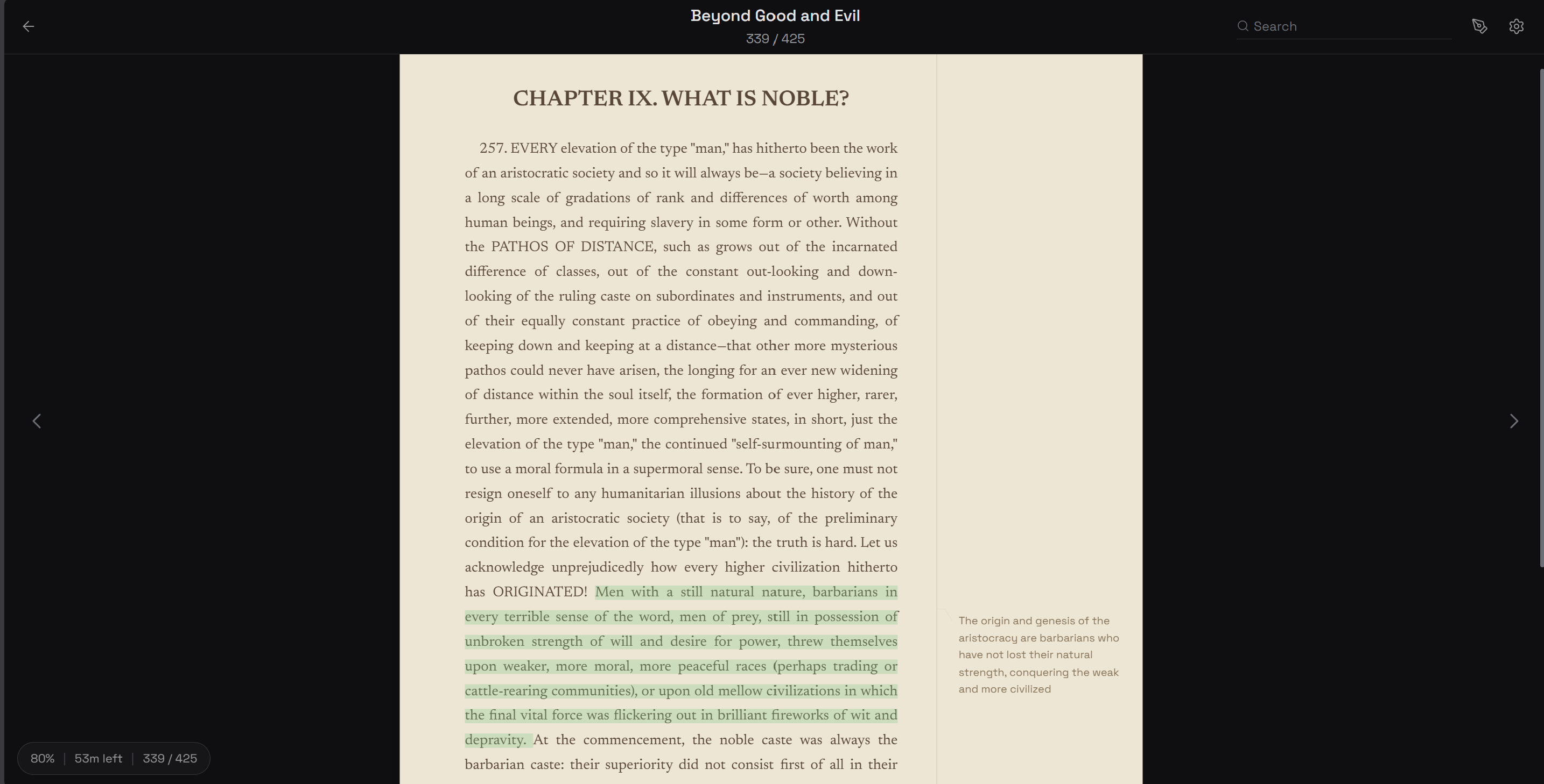
I wanted a reader where annotations matter as much as the text. Built one.
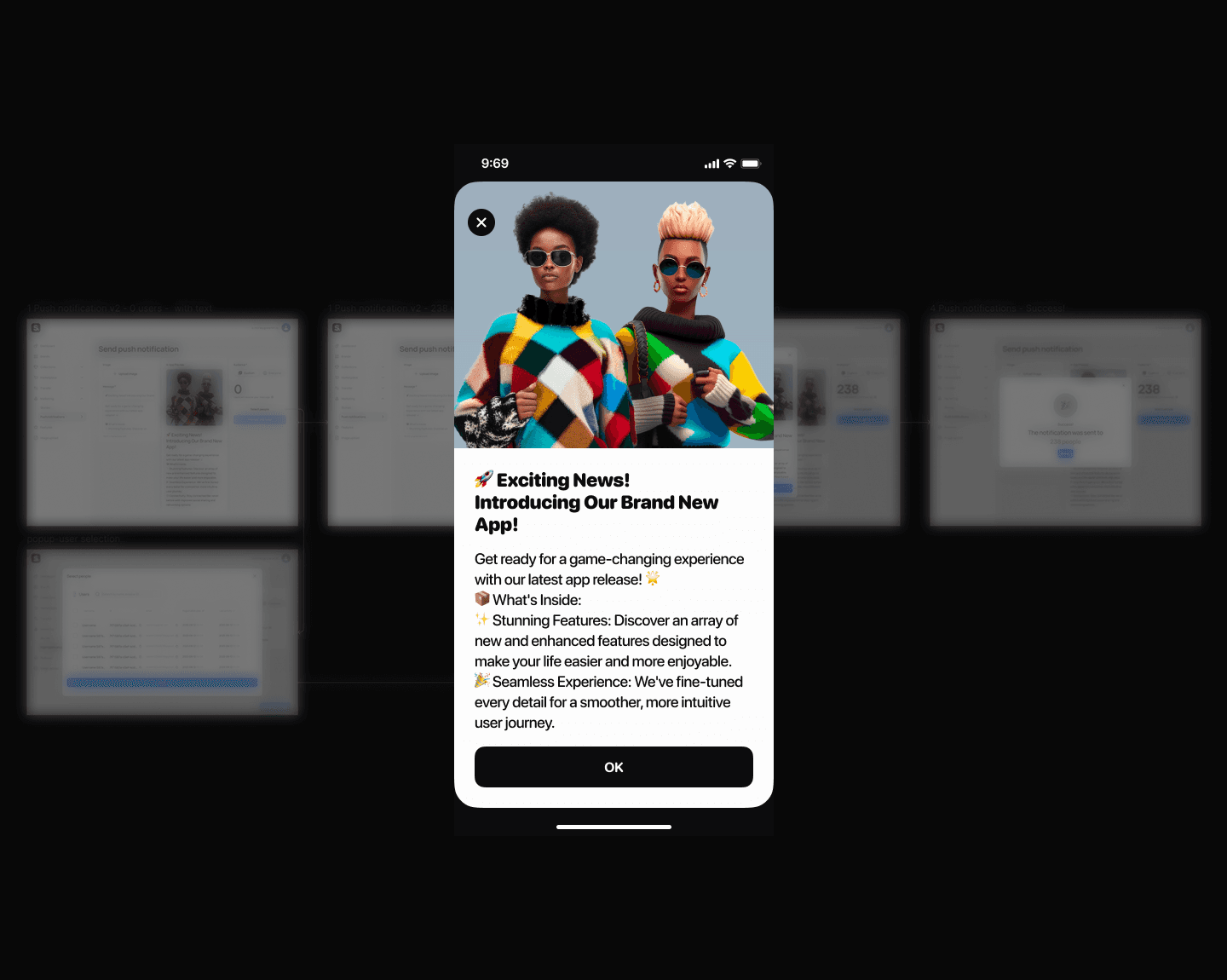
Push Notifications
How to kill the send button nobody wanted to press
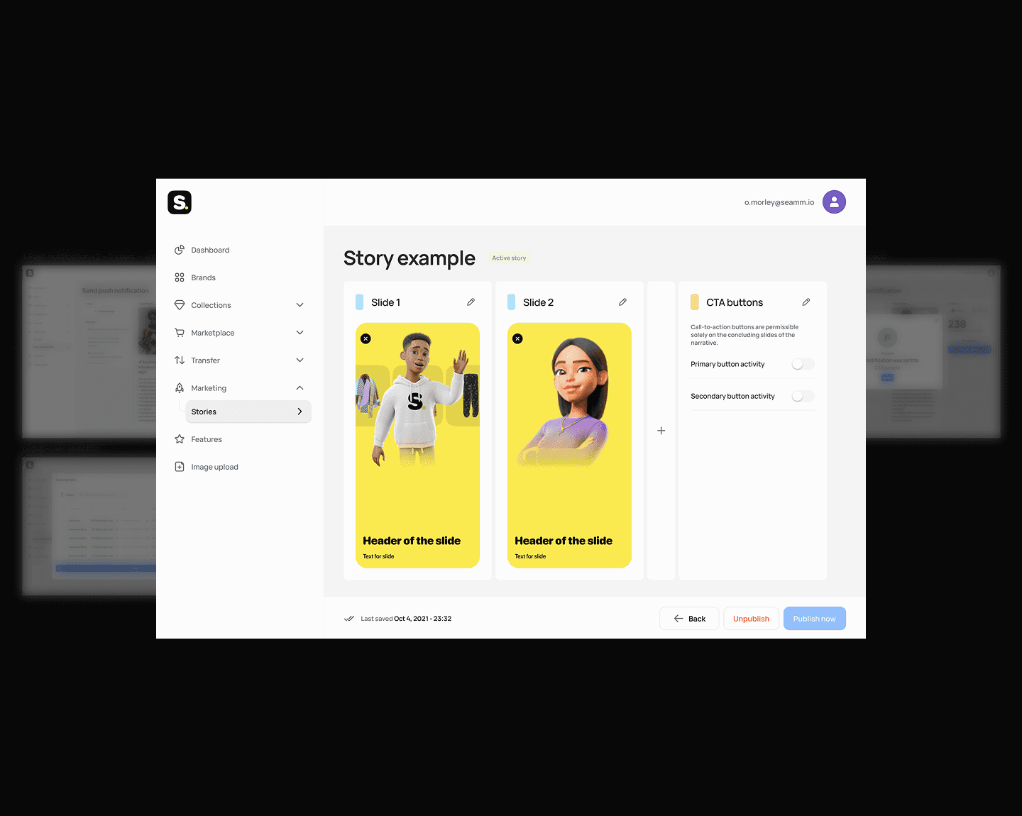
Stories Editor
How I eliminated a 2-day content publishing bottleneck
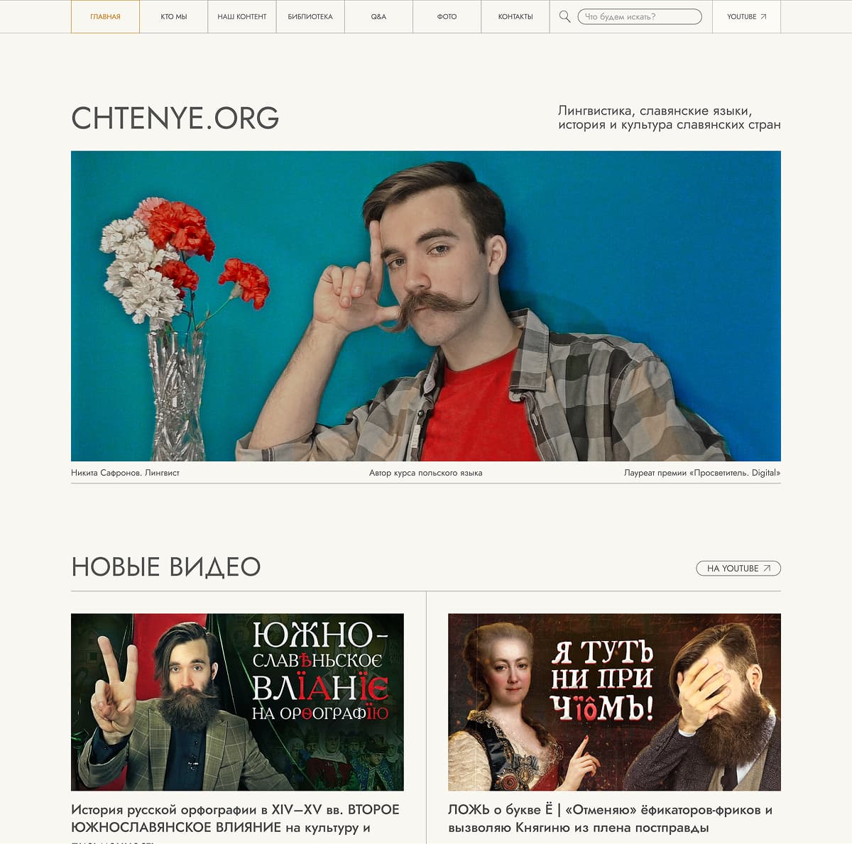
Educational Platform Redesign
Users couldn’t explain what a single menu item meant
Multi-Agent AI Workflow
I built a 10× prototyping workflow using AI agents — and what it taught me about product design
3D Museum Puzzle
Applied to a casual game studio, got rejected, built a working 3D puzzle prototype instead.