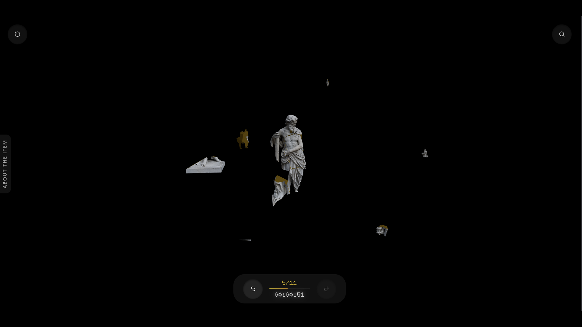
Chtenye · 2023
Educational Platform Redesign
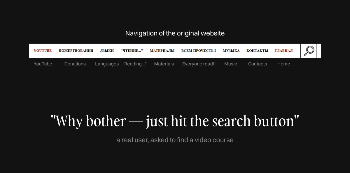
Users couldn’t explain what a single menu item meant.
Users failed basic navigation — not because of bad design, but because every label was misleading. Ran user testing, rebuilt the taxonomy based on real findings, and designed a scalable UI system.
UX Research, IA, UI Design
Solo designer + client stakeholder
- +80% task success rate
- 12 → 5 categories
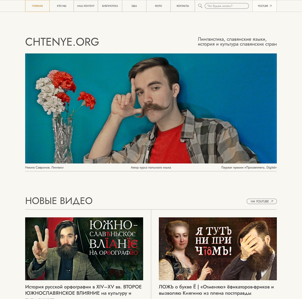

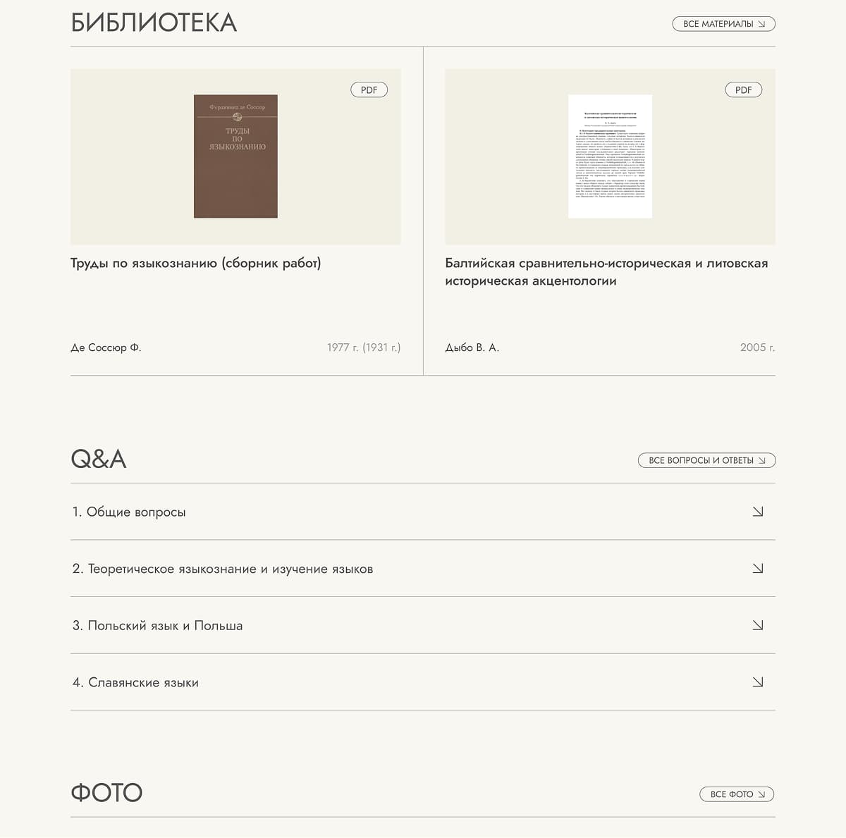
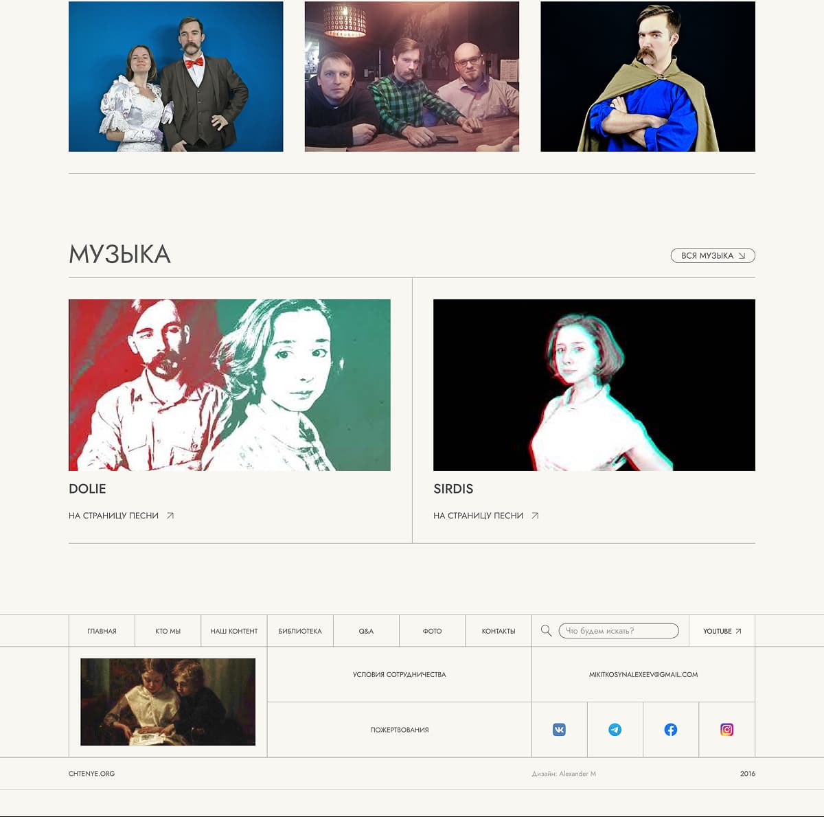
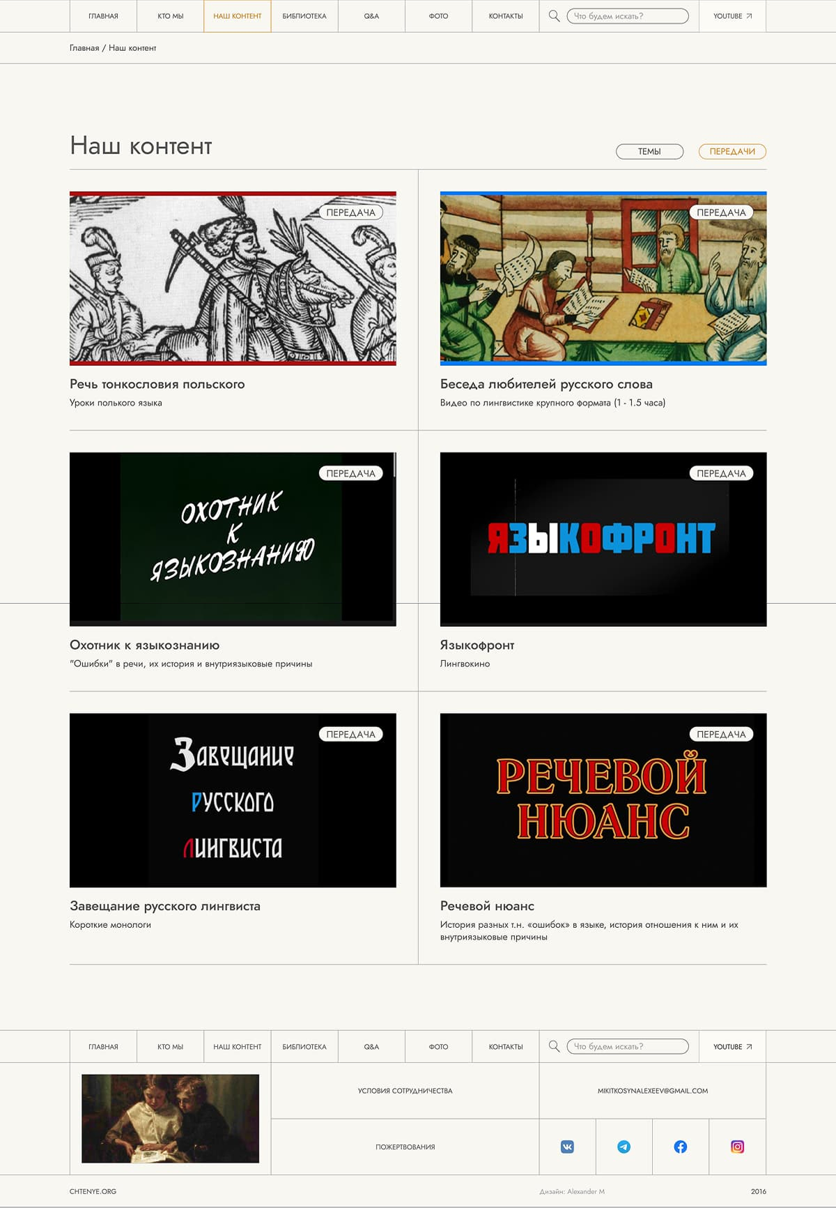
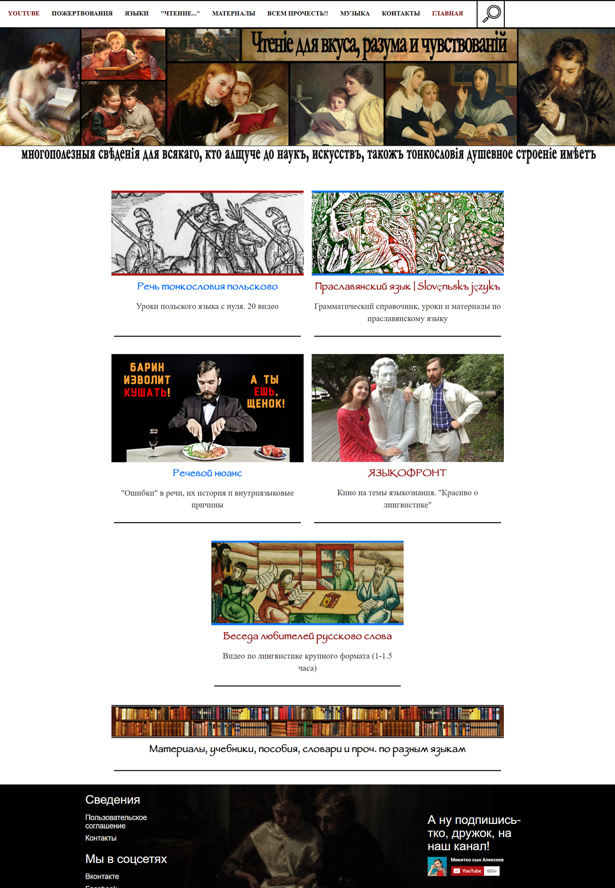
Five redesigned pages. Scroll each to explore the full layout.
A menu that works against its users
Chtenye is a content platform for a popular linguistics YouTuber — a curated library of video courses, lectures, articles, and research papers across linguistics, cultural studies, and related fields.
The site had 12 content categories in the navigation. On paper, that sounds organized. In practice, users couldn’t find anything. The category “What We Do” contained all video content — courses, lectures, interviews. But not a single test participant guessed that. They all expected a mission statement or a description of past projects.
Competitors like Postnauka and Arzamas scored higher on navigation despite similar content volume — they solved discovery through thematic curation, not category multiplication.
Three users were enough
Nielsen Norman Group’s research shows that 5 users uncover 85% of usability problems. I needed only three — the problems were so severe that every participant hit the same walls.
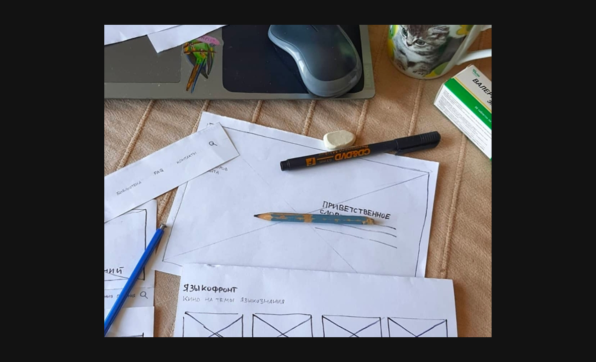
I tested three things: the live site on a tablet, a prototype built from the client’s proposed structure, and my own paper prototype with a different taxonomy. Same tasks across all three: find a Polish language course, locate a research paper, browse out of curiosity.
Key findings:
- 01All three users went to 'Library' looking for video content — and found only text materials. One said 'there was nowhere else to go.' Another considered leaving for YouTube entirely.
- 02'What We Do' was universally misread as an about page. Users expected mission statements and project descriptions — not the platform's entire video catalog.
- 03Category card drill-downs added 3+ steps before users could even tell they were in the wrong section. A flat filterable list would let them see the mistake in one.
- 04Users searched by format (video vs article), not by topic — but the navigation was organized by topic only.
- 05'FAQ' was interpreted as technical support ('like Gosuslugi or Yandex Taxi'). Users suggested 'Q&A' as a friendlier alternative.
- 06Footer with expanded second-level navigation became an unexpected shortcut — multiple users preferred it over the header for finding deep content.
Three rounds, three days
Three test rounds, each with a different structure. The live site and the client’s proposed prototype reproduced the same navigation failures — the “What We Do” label fooled every participant.
My prototype renamed it to “Our Content.” Two out of three users got it immediately. But putting raw playlists on the homepage blurred the line with the content page — one user said: “I thought this IS the ‘Our Content’ page.” A quick follow-up round replaced playlists with preview blocks — thumbnail, description, button to the internal page — and the confusion disappeared.
Three principles that rewrote the navigation
The research revealed three structural principles:
- 01Users search by format (video/article), not by topic. So format filters became the primary navigation mechanism on content pages.
- 02Users want to browse, not drill down. Even when given filters, they preferred scrolling through a flat list over making sequential category choices. Every additional click before seeing content delayed their ability to realize they were in the wrong section.
- 03Labels must describe what's inside, not what the team calls it internally. 'Library' sounds like books. 'What We Do' sounds like an about page. Renaming based on user mental models solved half the navigation problems before any visual design.
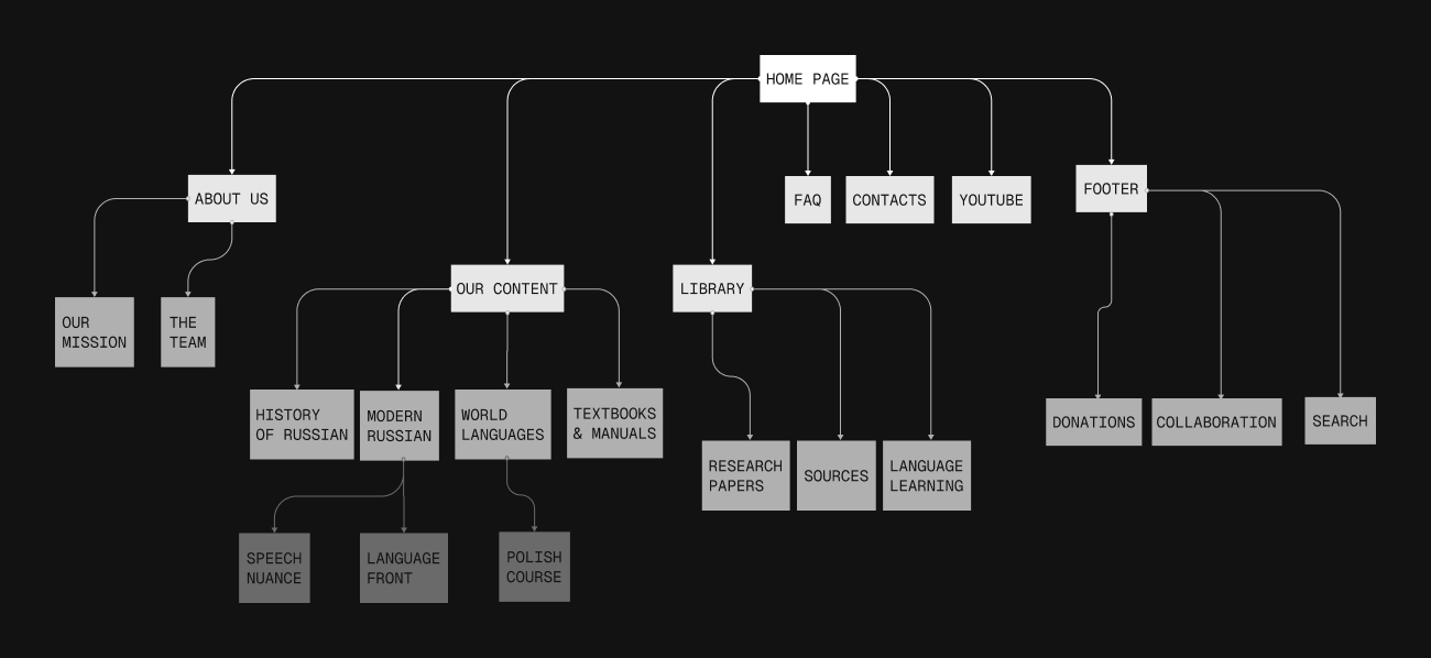
The site map went from 12 overlapping categories to 5 clear entry points, each with a transparent name that users could predict the contents of.
Results
+80% task success rate
Navigation tasks that previously stumped every single participant — finding a video course, distinguishing content types, understanding what a category contains — now completed successfully by 4 out of 5 users.
12 → 5 top-level categories
Each category name validated through testing. Users could predict what's inside before clicking — the primary failure point of the original navigation eliminated entirely.
One filterable system for all content
Replaced category card drill-downs with flat filterable lists. Users see content immediately, can browse freely, and recognize wrong turns in one step instead of three.
What I learned
Test the words, not the wireframes.
Every navigation problem traced back to a label that meant one thing to the team and another to users. Three tests caught what months of internal discussion missed.
Flat lists beat deep hierarchies.
Users preferred browsing a filterable list over drilling down through category cards. Every extra click before seeing content is a click where they might give up.
Paper prototypes get more honest feedback.
Low fidelity forced participants to react to structure, not aesthetics. They spoke up more, questioned more, and gave feedback they'd filter out in a polished prototype.
More case studies
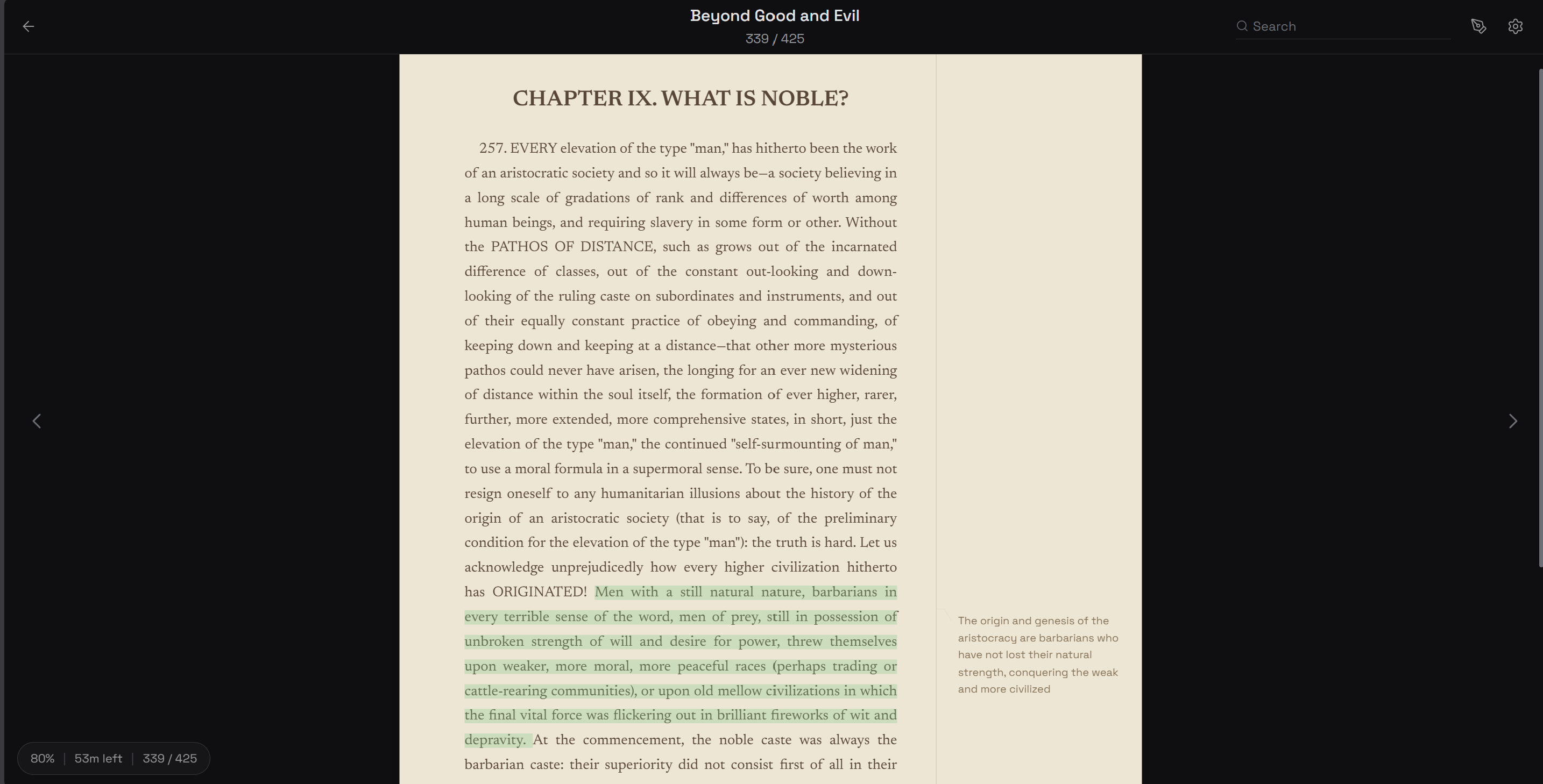
ReMargin
I wanted a reader where annotations matter as much as the text. Built one.
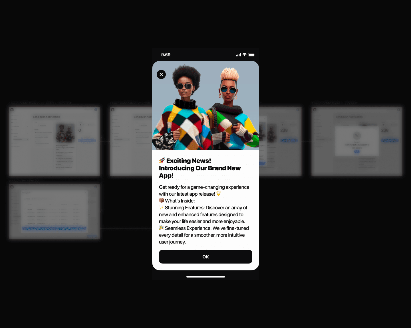
Push Notifications
How to kill the send button nobody wanted to press
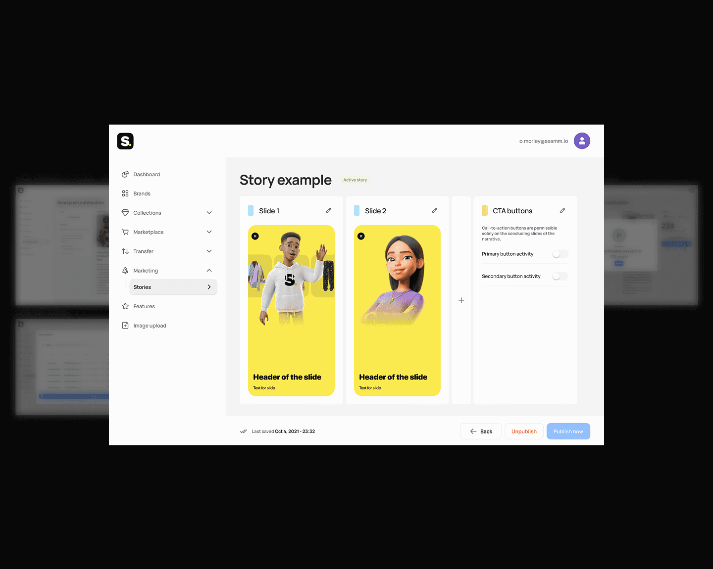
Stories Editor
How I eliminated a 2-day content publishing bottleneck
My Sleeping Gypsy
How to sell heritage craftsmanship without looking like fast fashion

Multi-Agent AI Workflow
I built a 10× prototyping workflow using AI agents — and what it taught me about product design
3D Museum Puzzle
Applied to a casual game studio, got rejected, built a working 3D puzzle prototype instead.